The Legend:

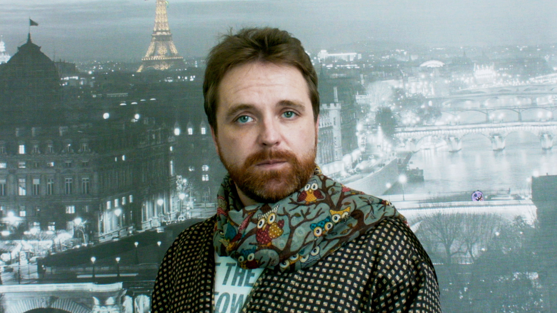
Corey Hudson is a life-long lover of storytelling and an advocate of all things multimedia. He has been producing video, developing interactive rich-media, managing integrated teams and designing cross-disclipline workflows for over a decade. His expertise in multiple worlds is what eventually elevated him into the unique position he enjoys in his career today.

Corey has carved out a place for himself in an emerging market where companies need an expert to help them manage and execute teams and projects across platforms and disciplines.

How did Corey come to specialize in dual-field of traditional media such as video, and the code-heavy world of interactive development? The short answer is that he just dove into both. He soon began to understand how both could compliment one another as new technologies continued to emerge.

Meet Corey

For more about Corey's background story, read on:

Read on...

Corey began his career in video production and post-production. He helped run a school television show on a local public access channel called Timberwolf Tracks for the majority of his high school years. He shot a documentary for the University of Oklahoma in Switzerland during the summer between his high school graduation and beginning his college education. In college he partook in numerous live television productions, documentaries, independent film productions and radio broadcasts.

While in college he also cultivated his other passion: interactive media. He was hired to design, develop and manage the entire website for the School of Art at the University of Oklahoma throughout his college years. His work there led him in a more interactive direction right out of college when he joined En101 Inc. where he would oversee the development of an interactive, multi-language learning platform as well as the global marketing of the entire company and brand.

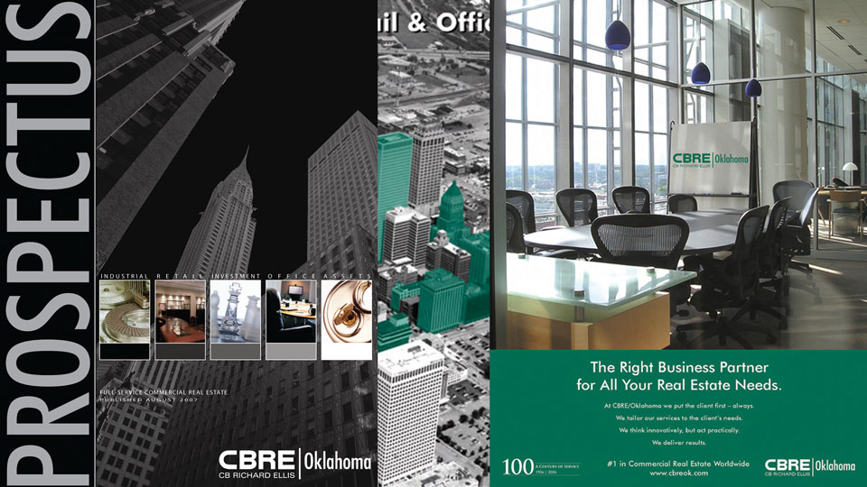
The experience with brand management at En101 piqued his interest and he moved to a position with the regional headquarters of commercial real estate giant CBRE where he was hired to reinvent, standardize, template, and execute all print and digital advertising as well as publications and marketing materials for all company efforts including: direct-to-consumer, website, a slew of advertising platforms… literally, everything the company utilized.

His passion for video did not ever leave him. In 2007 he was brought to Los Angeles to shoot a music video for the band Lokomotiv to send to MTV Asia ahead of their tour in Asia. When he saw the kinds of opportunities flooding this much larger market, he knew he was in Los Angeles to stay. He found the perfect blend of video production and interactive media, in an industry where brand management is king: advertising.

Corey accepted a position with West Coast advertising giant Rubin Postaer and Associates where he quickly became an invaluable asset, bridging the previously separated worlds of creative work and technical development.

His passion for storytelling translated smoothly and effortlessly from the linear world of video to the interactive world of user experience. He often utilized his knowledge of both to blend the two in ways that were never before possible for the agency and their clients until he integrated the departments born of two different worlds to work in unison from the very beginning of a project’s concept. So many new things were possible now that professionals from both disciplines could regularly consult one another and learn to think like one another, ultimately redefining the boundaries of what is possible far beyond what either was able to achieve without the other.

After working longer than he ever has for one company, he had hit a ceiling, simply because everyone loves to work there and has no desire to leave - especially those holding the highest of positions. So, Corey took some contract offers to direct music videos and some other longer format projects that he had done little of since entering the world of advertising. Wildly satisfied with these projects, he began to long to belong to a larger family again. Now he is excited to see what other companies in Los Angeles could achieve by welcoming him into their ranks!

The Portfolio
Please explore these portfolio selections and enjoy a few of Corey's projects! You may also connect with Corey on LinkedIn (below) to be notified of updates as they become available.

Oh My God
Oh My God (video)
Route66
Route 66 (web)
CR-Z Experience
CR-Z (app)
LA 38 EP
LA38 EP (print)
Acura Advance
Advance (rich media)
CBRE
CBRE (print)
Musical Road
Musical Road (game)
Leap List
Leap List (Flash)
Want More?
Great - more is coming! You can reach out on LinkedIn to be notified when more becomes available.
Connect on LinkedIn
This is where the messages go.
Close
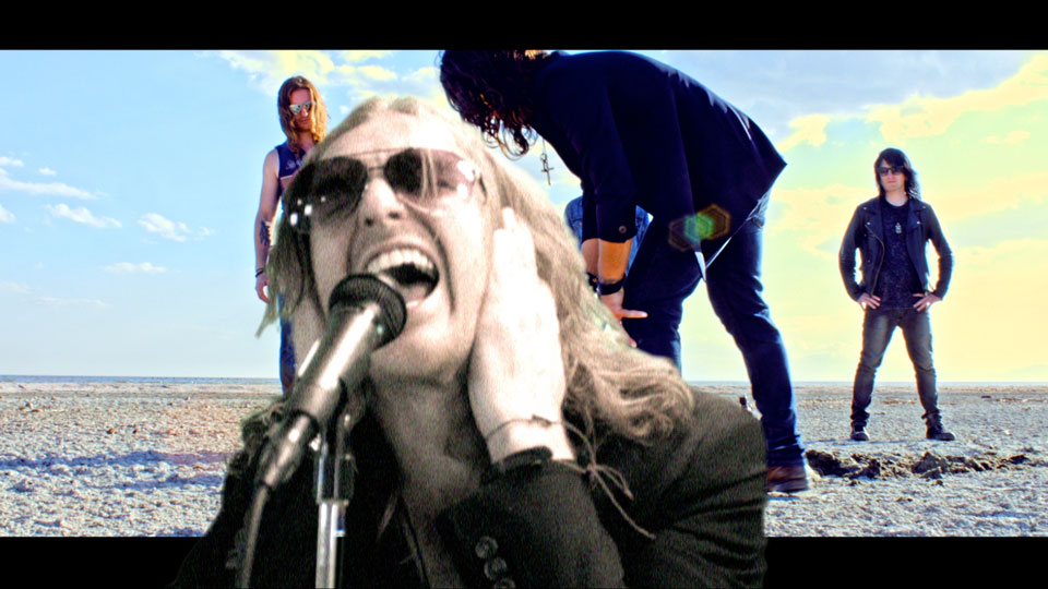
Official Music Video

Shot on-location in the Salton Sea, the goal was to please fans by matching the overall tone, pace and attitude of the song. Judging from the reviews online, in magazines, and straight from the fans - I think we pulled it off. It would be an understatement to say that I am not the biggest fan of what compression does to such high-detail videos for presentation online, but hey - it is what it is... And it is still awesome!

What are you waiting for? Crank the volume way up, launch the video and watch it as large as you can!

Watch Now!
Read on...

Want to read more about it? Okay. The band came to me and let me know that they planned to release the single "Oh My God" off their new album Nomads a month ahead of the official album release concert at the Viper Room, and they wanted to make a big splash by releasing the single with an official video.

I was dying to use my new Blackmagic Cinema Camera and the revamped DaVinci Resolve Studio, so I was instantly onboard. They knew they wanted this much: a coffin, the desert, and them. So we put our heads together to fill in the gaps. One short, winter day in the desert, one evening on a Hollywood green screen stage, one non-existent storyboard, and a whole lot of editing all added up to this video. We are really proud of what we came up with, mainly because of the extremely short timeframe in which we had to work.

The video, along with the single, dropped worldwide on January 25th, 2016, followed by the release of the album Nomads on February 19th, 2016. We had so much fun together, we are already storyboarding a couple of other videos for songs on the album. With a little more time on our hands, we will be storyboarding more properly.

These guys make real rock and roll in an age where it often seems to be missing. I highly encourage you to check our more of their music. If you're in Los Angeles, they play on the Sunset Strip, right in your back yard, and you can even see this music video outside the Hard Rock Cafe at Universal Studios Hollywood - 4 times a day! But everyone should just go ahead and buy the album.

Quick Info

Client:Blushing Cad Studios

Year:2016

Role:Director, Editor, Colorist

Hardware:Blackmagic Cinema Camera, Mac Pro

Software:DaVinci Resolve, Final Cut Pro

Recognition

Now Playing:Universal Studios Hollywood CityWalk

5 Towers - 4* Daily Showtimes:10:40a | 12:40p | 5:10p | 8:35p *Live events hosted at 5 Towers will overtake any programming on the Jumbotron.
Interactive Road Trip

One day while I worked at RPA, our team was challenged with creating a compelling user experience that felt more like storytelling than advertising for Honda's all-new Accord Hybrid. Several gurus across disciplines at the agency put our heads together and came up with a road trip from Chicago to LA, down America's beloved Route 66, in the brand new car.

We thought of everything: maps that show your route, trip photos, a functional odometer - the works! It was my job to figure out a way to program this beast to excel, while still supporting browsers as far back as IE8.

*Note: The magic of this project is in its desktop version. If you're on a computer, dive-in! If you are on a mobile device, unfortunately you will be redirected to a different experience. I am working to serve a copy of the site myself or get a demo video up for mobile users as soon as I can. If you want to know more about the project, read on below.

Visit Site!
Read on...

As is often the case in this fast-paced field, we didn't have enough time for several versions, and we didn't even have available developer resources for multiple solutions either. So it all fell solely on my shoulders to figure out how to make this thing work for everybody. Canvas was not an option, and there was going to be no real backend for data. So, I came up with my own JavaScript animation engine from scratch.

The final solution was born of compromise. There was no time for prototyping, the creative team wanted pixel-by-pixel assurance that it would appear exactly the same at any screen size. This meant no independent, full-screen fluid background, so we had to force the ratio to stay the same. In order to preserve the level of control over placement that they insisted upon, I defined the positions of everything in a JSON object, used percentages to calculate the difference from the initial size on load and on resize, then translate it back into pixels.

Then I decoupled rendering from the scroll events, took advantage of requestAnimationFrame so that I could control how often repaints occur and the result was an incredibly robust, high-performance scrolling website that everyone could use because it did not rely on canvas or any other HTML5 elements that, at the time, were not supported for the majority the client's visitors. We were very proud of how this turned out, and humbled by the awards and recognition it received.

My main regret was that we did not have just another week or two. I programmed this to be very intelligent, and I tested it on mobile, and it worked!... But the images were way to large in file size. I wished to create 3 additional sizes of every asset and add logic to choose the appropriate size for each device - but alas, we could not include that. We also began logic to incorporate sounds and video that was very promising. But, you know how it goes. It wasn't a requirement; and meeting the deadline was. Ultimately, it is still very cool and has served the client and the agency very well.

Quick Info

Client:American Honda Motor Co.

Year:2014

Role:Creative Technologist

Front-End:HTML, CSS, JavaScript

Back-End:.NET, JSON

Awards

2015 Gold ADDY Website American Advertising Awards Los Angeles Competition

2015 Silver ADDY Websites Consumer American Advertising Awards National Competition

CR-Z iPad App & Microsite

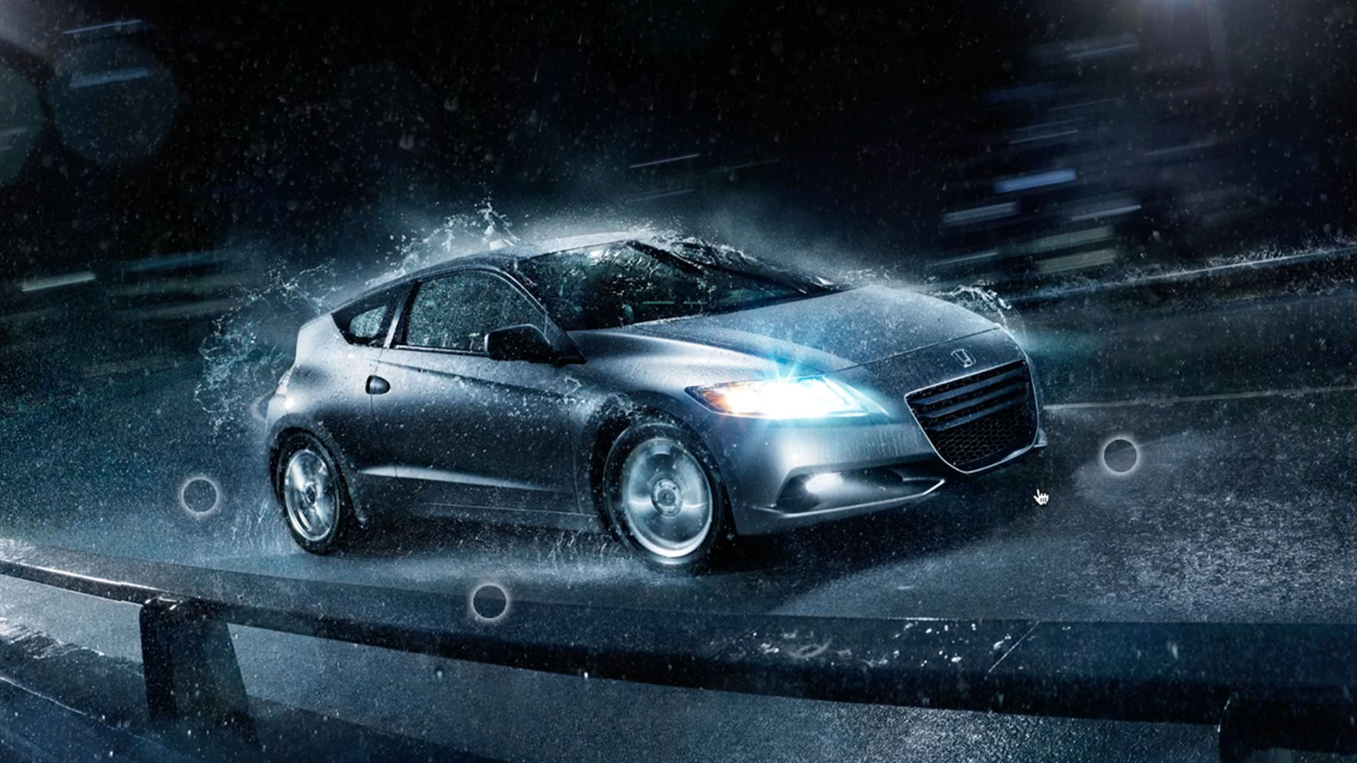
The world's first Sport-Hybrid! The client's first iPad app! The agency's first mobile anything! How do you find a project more exciting than that?... My first huge responsibility as the agency's rather recently minted Integration Manager! (Gulp, that'll do it.)

This project was developed as both an iPad app and a Flash microsite.

*Note: If you are on a computer, knock yourself out with it! Unfortunately, the app can no longer be downloaded or installed. Nor can the microsite be viewed on a mobile device. Sadly, it seems that mobile devices want to see Flash dead and under dirt, but I'll have a demo video recorded of the experience soon for phone and tablet visitors. If you are curious about the story behind it, feel free to read on too. This is actually a pretty good one.

Visit Site!
Read on...

This project was originally to be a Flash microsite when Apple released the world's first iPad in the middle of our production schedule, and the agency decided this should be the first project to launch us into the world of mobile apps (we had not done one for iPhone, ever).

We were already short on resources and everyone was already dedicated to other projects, while we had effectively tripled the amount of work needed in the same timeline that was already under way. Since I had arrived at the agency, I was already the only person with one foot in the creative world and the other in the development world. My background in video, coupled with my experience in Flash and ActionScript had already lent me a role of duality in an environment where the two worlds were pretty well separated by completely different departments.

So, I suppose it was rather natural for the agency to look to me to find a way to accomplish all of this. Their minds were set. I was already scheduled to be the developer of the Flash microsite. I was already the go-to consultant on any project to liaise between creative and technology professionals. And I had dabbled with OS-native programming. I emphasize "dabbled" because it is a very different world. I was a natural at Flash because it was the perfect development environment for individuals who were creative-minded and programming-minded at the same time.

Ultimately, I was able to get my boss to request a small budget increase to bring on a lead Xcode developer. Our art production resources all but pulled out when they determined they would be unable to triple their workload. Great. I got clever and found two interns who were unhappy with the department they landed in. They wanted to be creative. I managed-up a little bit, and boom. I've got my own, dedicated production team. Yes, I had to train them, but that gave me the opportunity to have everything created perfectly so that we could reuse assets between the iPad app and Flash version of the experience. Sweet! The programming of the app, unfortunately, was too much for one developer and I could help him very little while I had to write the entire Flash site by myself. So, we hired three mobile development interns to help him. Yes!

Just as things were looking up, the Digital Producer assigned to the project, for whatever reasons (I'm guessing the quadrupled workforce to keep up with had something to do with it), pulled out too. I couldn't believe it. But, with the short timeframe and tightly-knit mini-agency I had under my direction, it was a blessing in disguise to be able to take on that role and rework the schedules, omit loops, and refine processes.

Looking at each development as a challenge, rather than a problem, really showed me what we could accomplish when the chips were down. Ultimately, we were able to deliver the same, exact experience to users on computers as well as the world's newest device (the tablet), in two different languages - all without having to shoot a single extra piece of photography or CG. It was so much fun! A truly integrated effort. And I could feel proudly that I had lived up to the title that had been created for my range of skill sets: Integration Manager.

Quick Info

Client:American Honda Motor Co.

Year:2011

Role:Integration Manager

Desktop:Flash, ActionScript 3, JavaScript

Tablet:Xcode, Objective-C

Awards

2011 ThinkLA Interactive Award Best Use of Mobile Media ThinkLA Interactive Awards Los Angeles Competition

2011 Bronze ADDY Microsite American Advertising Awards National Competition

2011 IAB MiXX Award Tablet Marketing IAB Mobile Advertising

Rockin' Album Cover

This one is pretty straightforward. A classic case of the original person charged with the task was unable to continue after photography and concept. But Photography and concept alone don't create a product. I've made a living out of finishing jobs started by others, so this was no big deal: a welcomed retreat from the daily life of programming things that live and think and move. I was a print artist before anything else.

As I mentioned, they already had a concept, and photos, so I just pretty much listed to the band, delivered a few versions to them, went through a few revisions, and they ended up with this. I'm including it because I thought it was exceedingly fun and cool to do an actual album cover! Use the button below to see the full image. Also, feel free to sink your peepers into the before-and-after photo, so you can witness the magic Photoshop in skilled hands before your very eyes.

View Full Image
Before and After
Before and After
Quick Info

Client:Love and a .38

Year:2010

Role:Art Director

Hardware:iMac 2010

Software:Adobe Illustrator, Adobe Photoshop

Interactive Tour

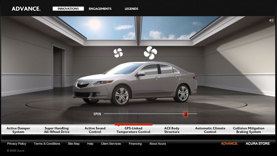
Here we have a Flash interface that takes you on a tour of Acura's latest technological innovations via rich media. Each section (or innovation) is actually deep linked so that the main Acura website could link from each product directly to the relevant part of this experience.

I've deep-linked you to start with GPS-Linked Temperature Control because it was the most technically challenging. A video explains how each of the dual climate zones independently increase cooling power as they get closer to direct sunlight and vice-versa. My challenge was to overlay the video with animated fans that could demonstrate this as the car spins in the video. But the fans are not part of the video! Once the video finishes playing, you can use a slider to spin the car yourself and see the fans reacting to their position relative to the sunlight. It was a really fun challenge! Of course, you can explore all the other features too. It's a very slick presentation.

*Note: This can only be viewed on a computer. Soon, I will have a demo video available for mobile visitors who can't use Flash.

See it Now!
Read on...

This was another project where my multi-disciplinary skill set was highly appreciated. When Acura came out with a new line of vehicles, they wanted to present those innovations in an innovative fashion. Flash was still very much in use, and I remember even being able to use this site on my first Android phone without any special or additional programming. A lot of people don't realize that even though mobile is responsible for expediting Flash's exile, it originally supported it with no extra effort.

Technically, RPA spawned a sister company (RP&) which was in a different building and employed an entirely separate group of people. This was a requirement from the client so that RPA could have the business of both Honda and Acura - as long as the same people did not influence both.

Prior to getting the Acura business and starting RP&, I had already solidified myself as "the one who lives in both worlds" (creative and development), or more professionally: the Integration Manager. The good folks on the RP& side wanted to have a go-to consultant for their projects too; someone to help translate and refine things from creative to development and then back again. Since many of the professionals working on the Acura business had previously worked with me on the Honda side, an arrangement was made, making me one of the very few individuals who were lucky enough to be able to touch both brands.

I really appreciated being in this position, as these were our two largest clients. Sometimes you would get the occasional change in pace on a single project for a smaller client, but I was now able to keep my mind open to a minimum of two different, ongoing energies - as opposed to being constantly enveloped in one train of thought. Honda's young, straightforward approach as well as Acura's, very different, professional, classy and somewhat aggressive approach. I miss those days at times.

Quick Info

Client:Acura of American Honda Motor Co.

Year:2011

Role:Integration Manager & Senior Developer

Web:Flash, ActionScript 3, HTML, CSS, JavaScript

Post-Production:Final Cut Pro, Adobe After Effects

Print Advertising & Publishing

Details coming soon!

Quick Info

Client:CBRE | Oklahoma

Year:2006-2007

Role:Marketing Manager

Software:Adobe Photoshop, Adobe Illustrator, Adobe InDesign

Contributions:Art Direction, Copy Writing, Photography, and Design from concept to publication.

Rich Media & Online Game

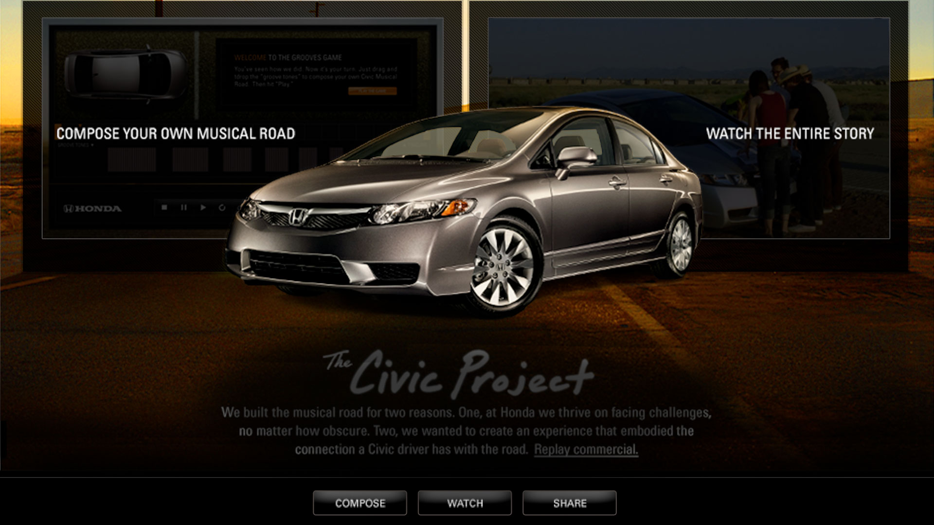
The goal was to wow viewers with the commercial for the Musical Road that we carved into a highway in Lancaster, CA during the commercial breaks in their shows and movies and provide interaction at the end of the commercial that allowed them to learn more through behind-the-scenes videos as well as build their own Musical Road and drive a Honda Civic along their digital Musical Road to make it sing.

Watch as much as you like! But make sure to build your own Musical Road before you're done! And feel free to read the story about how we made the interactive version of the Musical Road a reality, below.

*Note: This can only be viewed on a computer. Soon, I will have a demo video available for mobile visitors who can't use Flash.

Play Now!
Read on...

I worked closely with a rather large group of creative professionals to plan a rich media module and landing page that could be used to engage viewers on video content websites such as NBC, ABC, CBS, Hulu and so on.

I was the only developer for all of these modules and landing pages, once we had finalized our plan together. I also worked closely with the Executive Producer and an outside sound engineer to create the notes for the game. We made several trips together to the engineer's studio where we made several tweaks to audio that was actually recorded by a microphone attached to a car driving over the real, physical musical road.

As a result, when placing each note that you choose to use in the game, you are actually playing back audio from the actual musical road. I had my reservations about the way the notes sounded. One night, I stayed up late creating a separate library of notes using Pro Tools, and an alternate version of the game that used these notes. I simply started with piano key sounds, and then ran filters to simulate the concrete-groove sound of the physical Musical Road.

I thought the notes sounded far more musical, but also with adequate authenticity. So, I brought this version to the team and also pointed out that we could include as many notes as we like with this method, rather than being limited to only the notes used in the exerpt from the William Tell Overture which had been drilled into the highway. I was vetoed. The Executive Producer was too married to the idea of marketing the sounds as "truly authentic". That's okay, its still really cool, and has that "authenticity factor" for you - and above all: its fun! It was even more fun to make.

Quick Info

Client:American Honda Motor Co.

Year:2009

Role:Senior Web & Flash Developer

Web:Flash, ActionScript 2, JavaScript

Post-Production:Final Cut Pro, Adobe Premiere Pro, Adobe After Effects

Awards

2009 Award of Excellence Integrated Campaign Communication Arts

2009 Belding Award Belding Sweepstakes Award ThinkLA

2009 Belding Award Belding Bowl Award ThinkLA

Integrated Campaign

Details coming soon!

View Page!
Quick Info

Client:American Honda Motor Co.

Year:2012

Role:Integration Manager

Front-End:Flash, ActionScript 3, HTML, CSS, JavaScript

Back-End:.NET, JSON, various social network API's

Awards

2013 Nominee Online Campaign Webby Awards Advertising & Media

2013 Gold ADDY Integrated Campaign American Advertising Awards National Competition

2013 Bronze ADDY Microsite American Advertising Awards National Competition

2013 Bronze Microsite International Automotive Advertising Awards (IAAA) International Competition

2012 Silver Cross-Media Integration IAB MiXX Awards Campaign

Meet Corey
Maybe Later
WATCH NOW
I'm a drangus.
CHECK IT OUT
Check it Out
";
Go Back